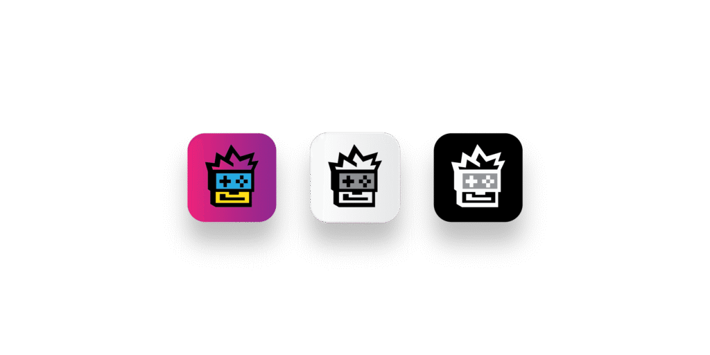
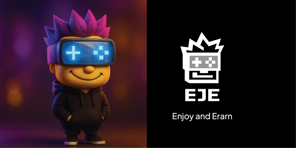
We started with listening and alignment, clarifying brand attributes and usage scenarios. We ran a divergent to convergent track: competitive research, semiotic review, multiple creative routes from our designers, and structured critique. We selected a lead route and iterated with intent. Geometry, proportions, stroke weight, character stance, small-size legibility and negative space were refined. We shipped a character mark and wordmark, mono and reverse variants, a minimal icon, a colour and type set, and practical guidelines for consistent use across product and community channels.