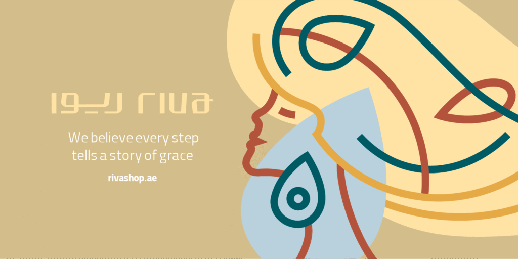
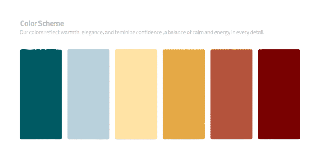
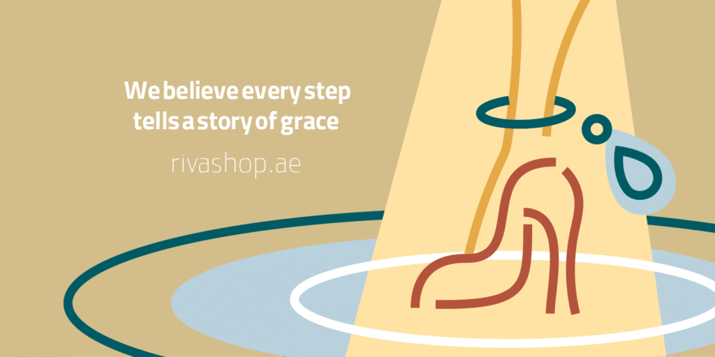
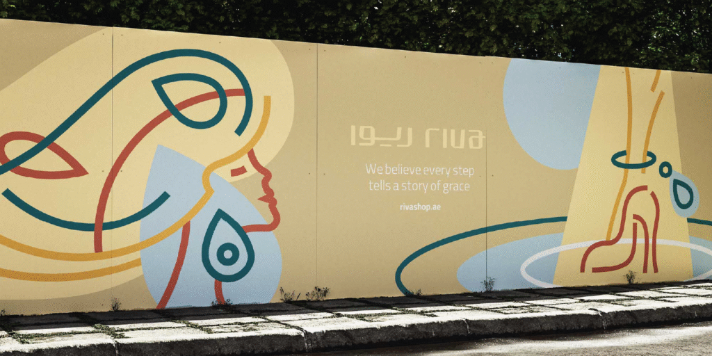
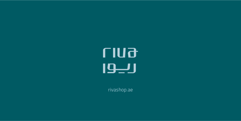
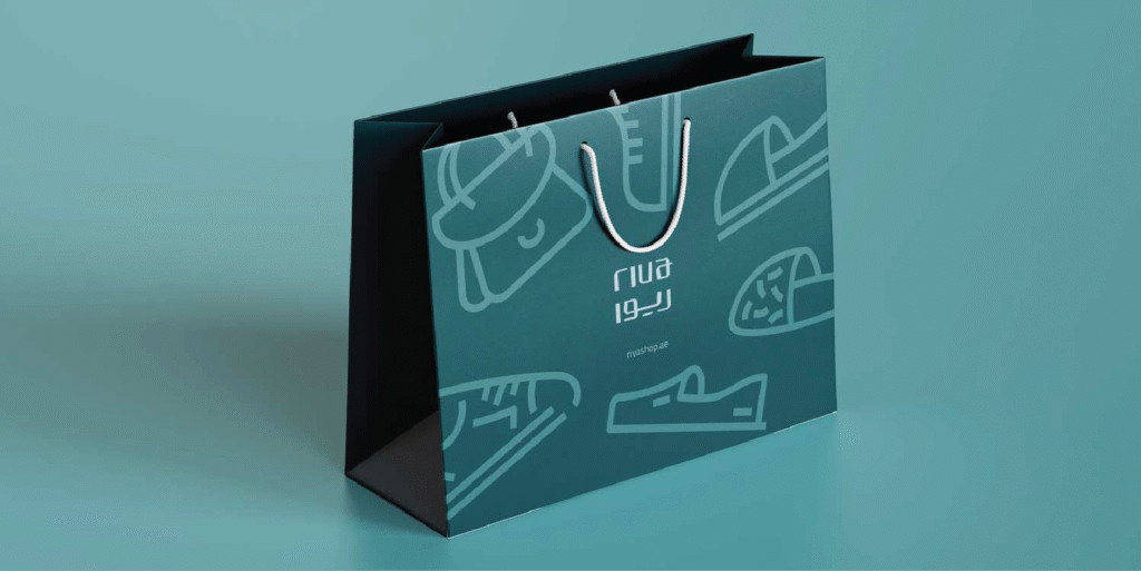
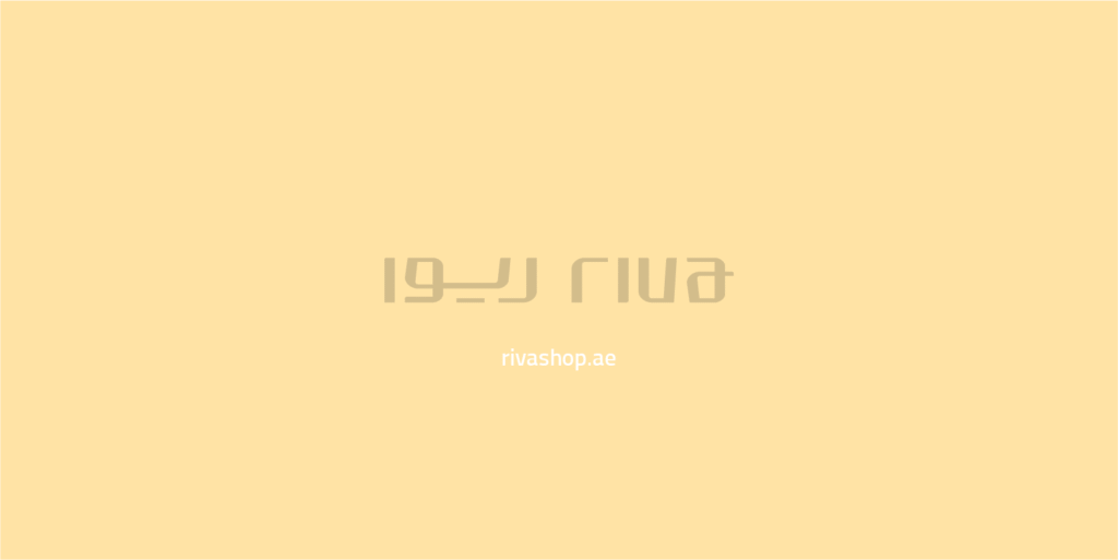
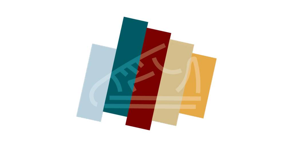
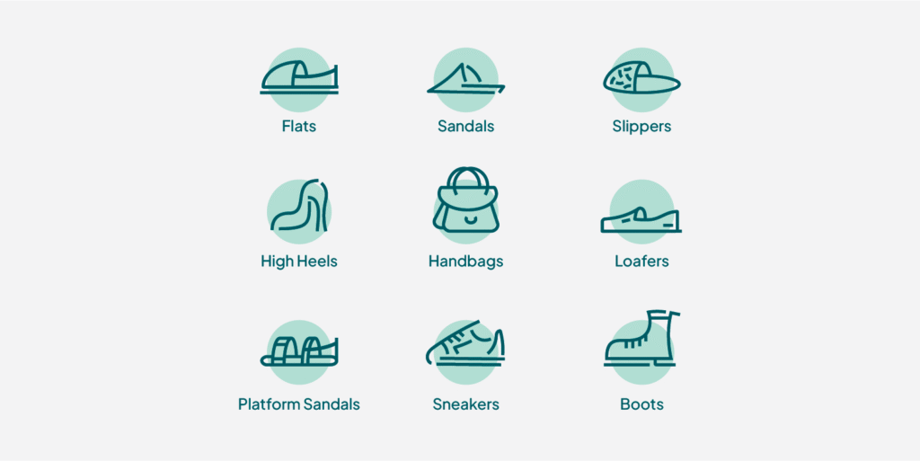
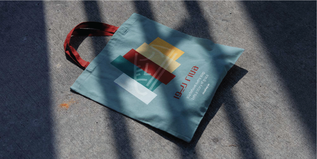
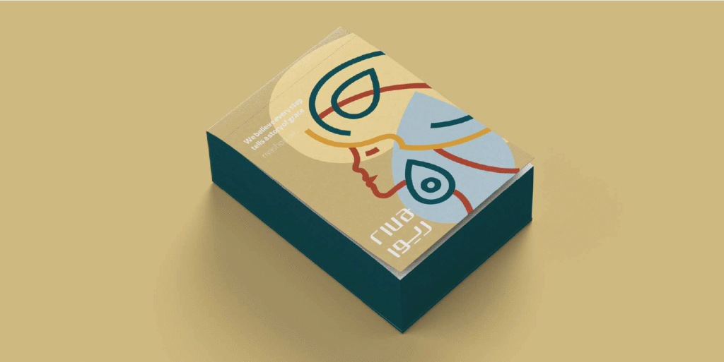
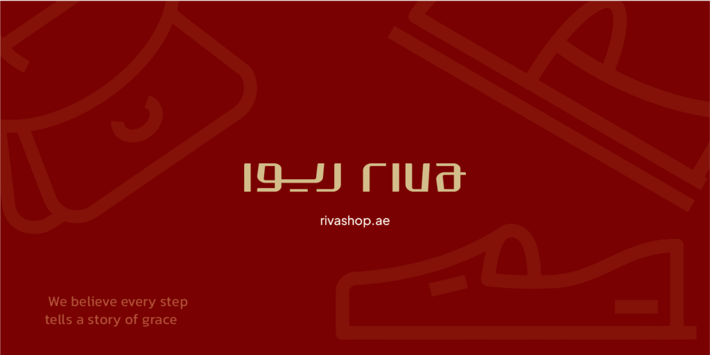
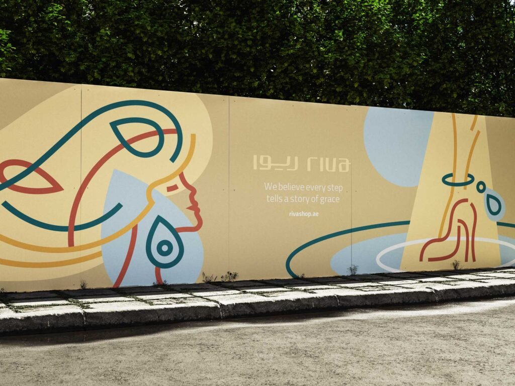
We started with listening and alignment. We clarified positioning, audience, personality, tone and key messages. Then we built a complete identity system: logo and wordmark in Arabic and English, paired Arabic–Latin typography, a colour system and tokens, icon set and graphic motifs, grid and layout rules for campaigns and social, and imagery guidelines with clear art direction. We added reusable templates and print specifications, including CMYK profiles and dielines for packaging and signage. Delivery was a Brand Book and an asset library so execution stays consistent across store, website and social.