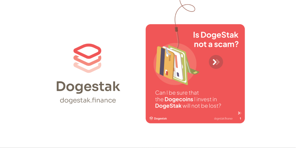
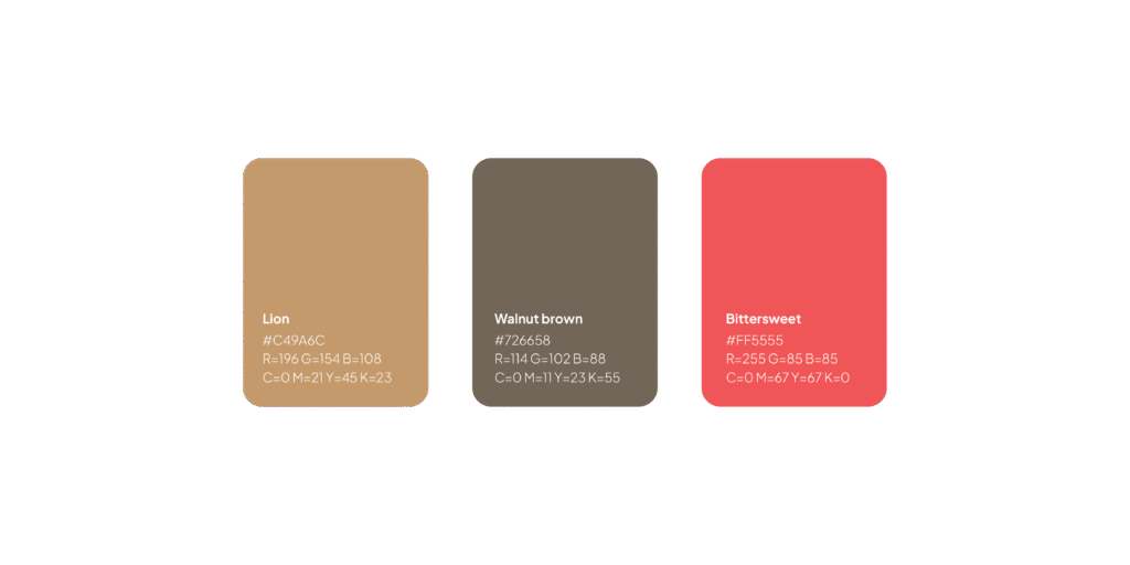
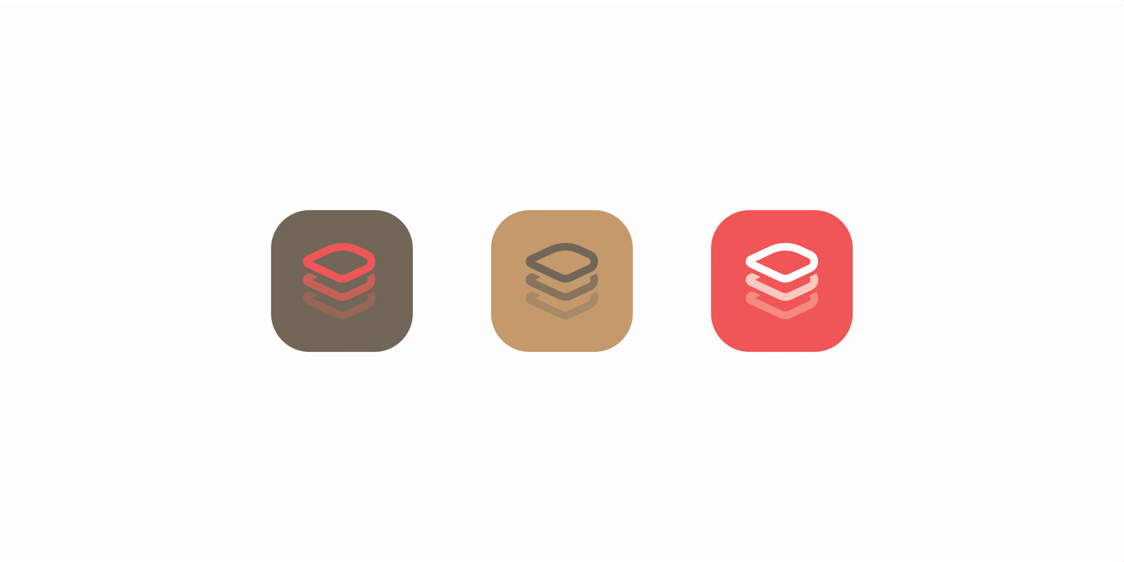
We designed a logo built on layered geometry to reference staking. Stroke weight and proportions were tuned for clarity at every size. A clean wordmark matches the product voice. Mono and reverse variants, plus a minimal icon for tight contexts. A colour system and usage rules keep the mark consistent across wallets, exchanges and social channels.